ShopDreamUp AI ArtDreamUp

Deviation Actions


Description
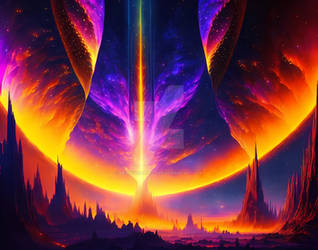
HND Graphic Design project, Adobe PhotoShop and InDesign, 2008. Image 5 of 5.
This brief was to create a "visual essay" based on the poem April Rise by Laurie Lee. The number of spreads, page size, borders and font were laid down in the brief, everything else was up to our own interpretation.
I had found the poem a bit twee for my taste and wasn't inspired to do a traditional illustration for it. Having taken a week away from it to complete other jobs, I was left with just the atmosphere of the poem, rather than getting bogged down in the words. The theme felt to be about appreciating life more intensely than you've ever done before. I got to thinking that was how people felt when they've been close to death, and so I took that as my starting point for the images.
I started reading cancer blogs to see what people were writing about coping with the condition. I then began to wonder whether I could link every single word of the poem to something written on the Internet about cancer. To my surprise, I could!
The picture above is one of the spreads, which consists of 2 separate images taken from the same PhotoShop file, with different layers switched on and off. The 2 images were then laid side-by-side in InDesign.
To make the left hand image, I would search for each word of the verse on a cancer blog, forum or news story. I took a screen cap of each one, then layered them into a PhotoShop document and scaled them down. I spread them across the background in the right order, masked off the bits I wanted to highlight and faded the rest into the background. The colour was based on descriptions in the poem. A soft eraser was used on the highlights so that they fade up from the sea of chatter.
The right hand image was made by adding text layers on top of the left hand image and typing the specific word from the poem. Therefore the positions of the words on the right hand side correspond almost exactly with their positions on the left hand side. The only exceptions were where two words appear in the same quote and I had to tweak their positions so they would read in the correct order on the right hand side.
I found this an extremely satisfying project to work on as I gave up much of the control over how it looked. I laid down strict rules as to how the words would be laid out and the screen caps would be faded but, apart from that, I just let the design evolve into whatever it was going to be. A bit like life, really...
The main cancer blogs I used can be found at [link] and [link] (in tribute to Leroy Sievers.)
Image size
3780x1890px 7.21 MB
© 2009 - 2024 ValWoodhouse
Comments0
Join the community to add your comment. Already a deviant? Log In